Chapter 11 Mapping
In this chapter you will learn how to create maps and visualize spatial data using R. You will learn how to import basic map layers and how to add spatial data to them.
11.3 Data
Spatial data can be in the form of vectors such as points (coordinates), lines or polygons and is usually stored in Excel, csv or shape files.
For the purposes of this tutorial, we will use a pre-existing dataset called quakes, which contains geographic coordinates of earthquakes near Fiji. Variables included in this dataset are: lat (latitude), long (longitude), depth and mag (magnitude).
We will start by loading and naming the dataset with the following command :
11.4 Base Maps
Import a base map
To visualize our spatial data, we need to overlay it onto a base map. There are several ways to do this, and this chapter will cover a number of options, including importing our own map, using a licensed map, and using a map included in an R package.
From a shapefile (.shp)
The best way to get a detailed map is to make your own using ArcGIS or QGIS, or download it from Google Earth Pro, OMS or any open data portal in shapefile (.shp) format. While options such as Google Earth Pro and ArcGIS are available, they may not be free or easily accessible. The sections below cover free and accessible approaches to importing maps, but if you happen to have a map in a shapefile format, you can import it using the st_read() command from the sf package, and then follow the steps shown in the section on plotting with ggplot2.
From Stadia Maps
Using Stadia Maps is probably the easiest way to get a free detailed licensed base map that we can use to overlay our geospatial data.
You will need to register (for free) and you’ll receive an API key.
Here are the steps:
Go to the Stadia Maps website.
Create an account
Verify your email address by clicking on the link that is emailed to you
Log in to your Stadia account
Go to Create a property
Name your property (e.g. the name of your project)
Click + Add API Key
Copy your API key and register it with the
register_stadiamaps()command from theggmappackage.
Once you have registered your API key, you will need to set the map boundaries. To do this, create a box containing all the data you want to display. Replace the limits with your minimum and maximum latitude and longitude.
bbox <- c(left = min(Longitude),
          bottom = min(Latitude),
          right = max(Longitude),
          top = max(Latitude))
Set the base map and select a map type. Valid map types can be obtained by searching for get_stadiamap in the Help tab.
Note: You may encounter an error regarding the zoom level. This is because your spatial data can’t all fit on the map at the selected zoom level. Try exploring zoom levels between 1 and 20.
basemap <- get_stadiamap(bbox = bbox, zoom = 16, maptype = "stamen_terrain") #Might need to adjust zoom level (between 1 and 20) in order to fit all your dataOnce you’ve set your axis limits and base map, you are ready to layer your spatial data and add annotations using ggplot2 functions. Follow this code structure:
yourmap <- ggmap(basemap) +

# Add your data
geom_point(data = mydata, aes(x = Longitude, y = Latitude))

# Put the limits again with the projection (crs)
coord_sf(xlim = c(minLongitude, maxLongitude), ylim = c(minLatitude, maxLatitude), crs = 4326) +

# After you can use all the ggplot arguments such as
  theme_minimal() +
  labs() +
  annotation_north_arrow() +
  annotation_scale() + #etc.
See the next section for an example of how to integrate ggplot2 functions.
Using a base map intergrated in a package
Some R packages, such as rnaturalearth, ggplot2, and maps, provide built-in map layers that are easy to use for visualizing large-scale datasets. While these maps are not highly detailed, they offer a convenient way to create quick visualizations.
The map_data() function in the ggplot2 package retrieves geographic data from the maps package, allowing you to create maps. The map_data() function accepts database names provided by the maps package. Search maps in the Help tab to see valid databases.
We will use the “world” database in this example.
11.5 Plot a Static Map with ggplot2
We will now create the base map layer by putting our geographic dataset into the geom_polygon() function and overlay our spatial data (earthquakes near Fiji) with the geom_point() function.
map1 <- ggplot() +

# Layer the base map with geom_polygon argument and customize the colors with fill argument
  geom_polygon(data = world_map, aes(x = long, y = lat, group = group), fill = "gray80", color = "white")  +

# Layer the spatial data with geom_point since we are working with way points
  geom_point(data = data, aes(x = long, y = lat), color = "red", size = 2) +

# Customize the theme and the labels
  theme_minimal() +
  labs(title = "Earth Quakes near Fiji",
       x = "Longitude",
       y = "Latitude")

# View map
map1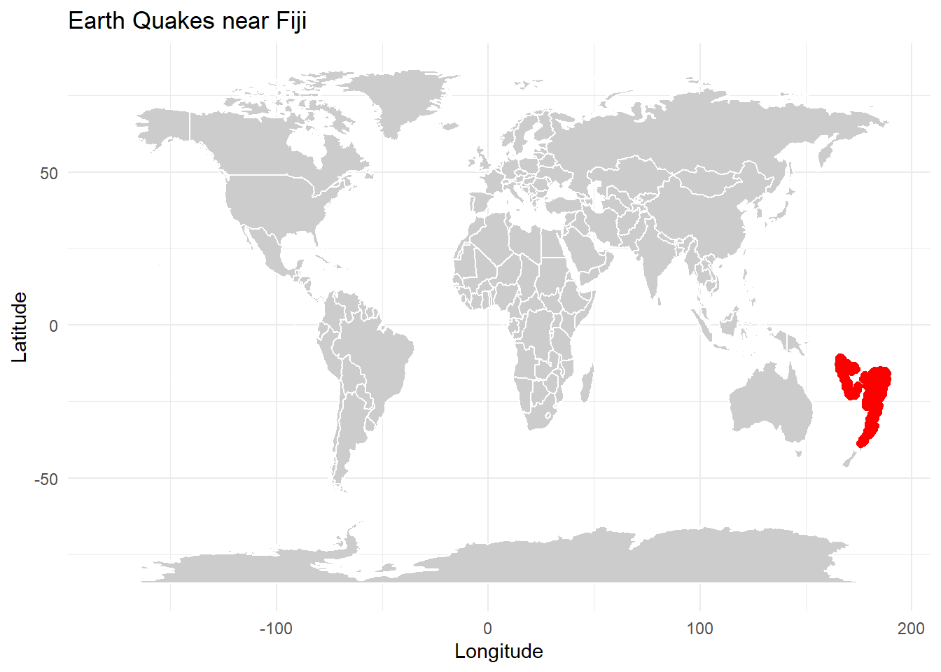
11.6 Axis limits
Depending on the map you have selected using map_data(), you may need to zoom in on a particular area to better visualize your spatial data. In our example we will use the coord_quickmap() function to refine the axis limits to zoom in on Fiji.
When we are working with a large spatial dataset it can be difficult to find the latitude and longitude extremes. We can quickly find the coordinate range of our data using the range() function.
lon_range <- range(data$long, na.rm = TRUE)  # Range of longitude
lat_range <- range(data$lat, na.rm = TRUE)   # Range of latitude
We can now adjust the map boundaries.
map2 <- map1 +

# Adjust the map limits to include all the points
  coord_quickmap(xlim = c(150,200), ylim = c(-5,-45))

# View map
map2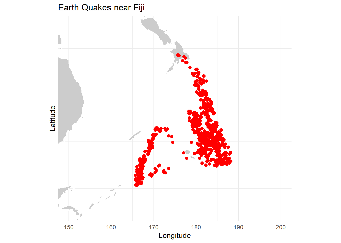
11.7 Group variables
To group data (e.g., earthquakes) by a factor or variable such as mag (magnitude) and visualize it on the map, you can adjust the aes() function within geom_point() to assign colors to different levels of the grouping variable.
Here’s how to do it:
map3 <- ggplot() +

# Layer the base map with geom_polygon
  geom_polygon(data = world_map,
               aes(x = long, y = lat, group = group),
               fill = "gray80",
               color = "white") +

# Layer the spatial data and group by magnitude (continuous factor)
  geom_point(data = data,
             aes(x = long, y = lat, color = mag),
             size = 1.5) + #set a fixed size

# Customize the theme and zoom in
  theme_minimal() +
  coord_quickmap(xlim = c(150,200), ylim = c(-45,-5)) +

# Add labels
  labs(title = "Earth Quakes Magnitude",
       x = "Longitude",
       y = "Latitude",
       color = "Magnitude") +

# Customize the color scale. Here is a preexisting color scale
  scale_color_viridis_c()

# View map
map3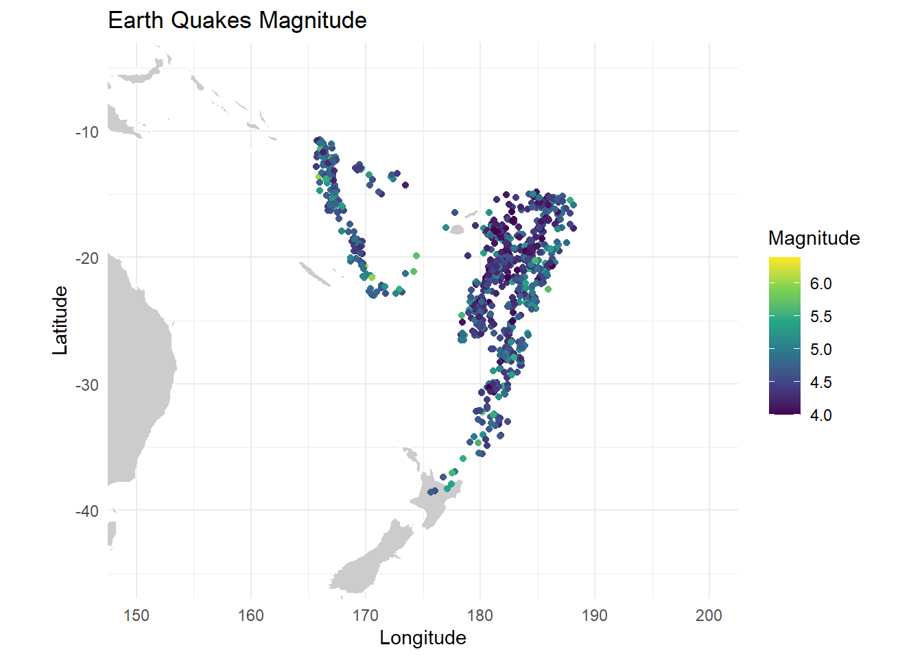
Let’s use mutate() to modify our magnitude column, demonstrating how to customize colors when grouping by a qualitative variable (using a discrete color scale).
Additionally, we’ll rearrange the data, which helps control the plotting order. This is especially useful in dense datasets to ensure certain data points appear on top.
#By checking the range we know how many categories to make
mag_range <- range(data$mag, na.rm = TRUE)

#Mutate using case_when to create a qualitative variable
data <- data %>%
  mutate(category = case_when(
    mag < 5 ~ "Light",
    mag >= 5 & mag < 6 ~ "Moderate",
    mag >= 6 ~ "Strong"
  ))

# Reordering data by category (Light -> Moderate -> Strong) indicates the order that our points are going to be plotted
data <- data %>%
  mutate(category = factor(category, levels = c("Light", "Moderate", "Strong"))) %>%
  arrange(category)
We can now assign colors manually with scale_color_manual() function.
map4 <- ggplot() +

# Plot the world map
  geom_polygon(data = world_map,
               aes(x = long, y = lat, group = group),
               fill = "gray80",
               color = "white") +

# Plot the points, grouping by magnitude categories
  geom_point(data = data,
             aes(x = long, y = lat, color = category),
             size = 1.5, alpha = 0.4) + # Set a fixed size for points and alpha for opacity

# Customize the theme and zoom in
  theme_minimal() +
  coord_quickmap(xlim = c(150, 200), ylim = c(-45, -5)) +

# Add labels
  labs(title = "Earth Quakes Magnitude",
       x = "Longitude",
       y = "Latitude",
       color = "Magnitude Category") +

# Customize the color scale for categories
  scale_color_manual(values = c(
    "Light" = "green",
    "Moderate" = "yellow",
    "Strong" = "red"))

# View map
map4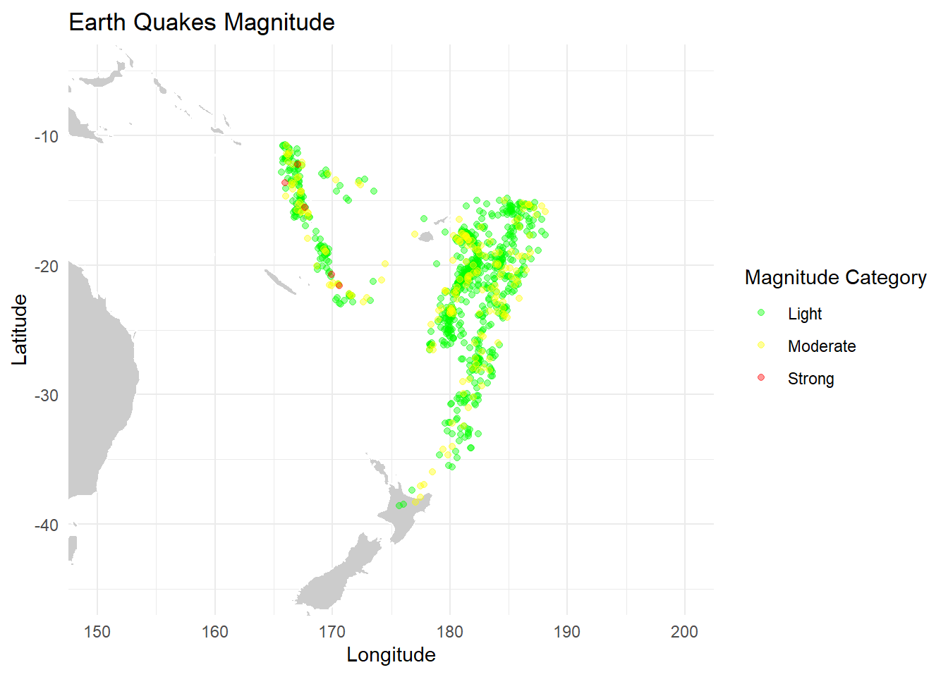
11.8 Scale bar & North arrow
In order to add an accurate scale bar and true north arrow to our map, we need to take our geographic coordinate system (latitude, longitude) and specify the Coordinate Reference System (CRS) code 4326. This code refers to the WGS84 projection, which is a coordinate system used in Google Earth and GPS systems. It represents the Earth as a three-dimensional ellipsoid.
To do this, we need to replace the axis limit function coord_quickmap() with the function coord_sf() from the sf package and add the argument crs = 4326.
map5 <- map4 +

# Set axis limits and indicate crs code
  coord_sf(xlim = c(150, 200), ylim = c(-45, -5), crs = 4326)+

# Add a North arrow
  annotation_north_arrow(location = "tr", #top right
                         which_north = "true",
                         height = unit(1, "cm"),
                         width = unit(1, "cm"),
                         pad_x = unit(0.5, "cm"),
                         pad_y = unit(0.5, "cm")) +

# Add a scale_bar
  annotation_scale(location = "bl", #bottom left
                   width_hint = 0.1) #

# View map
map5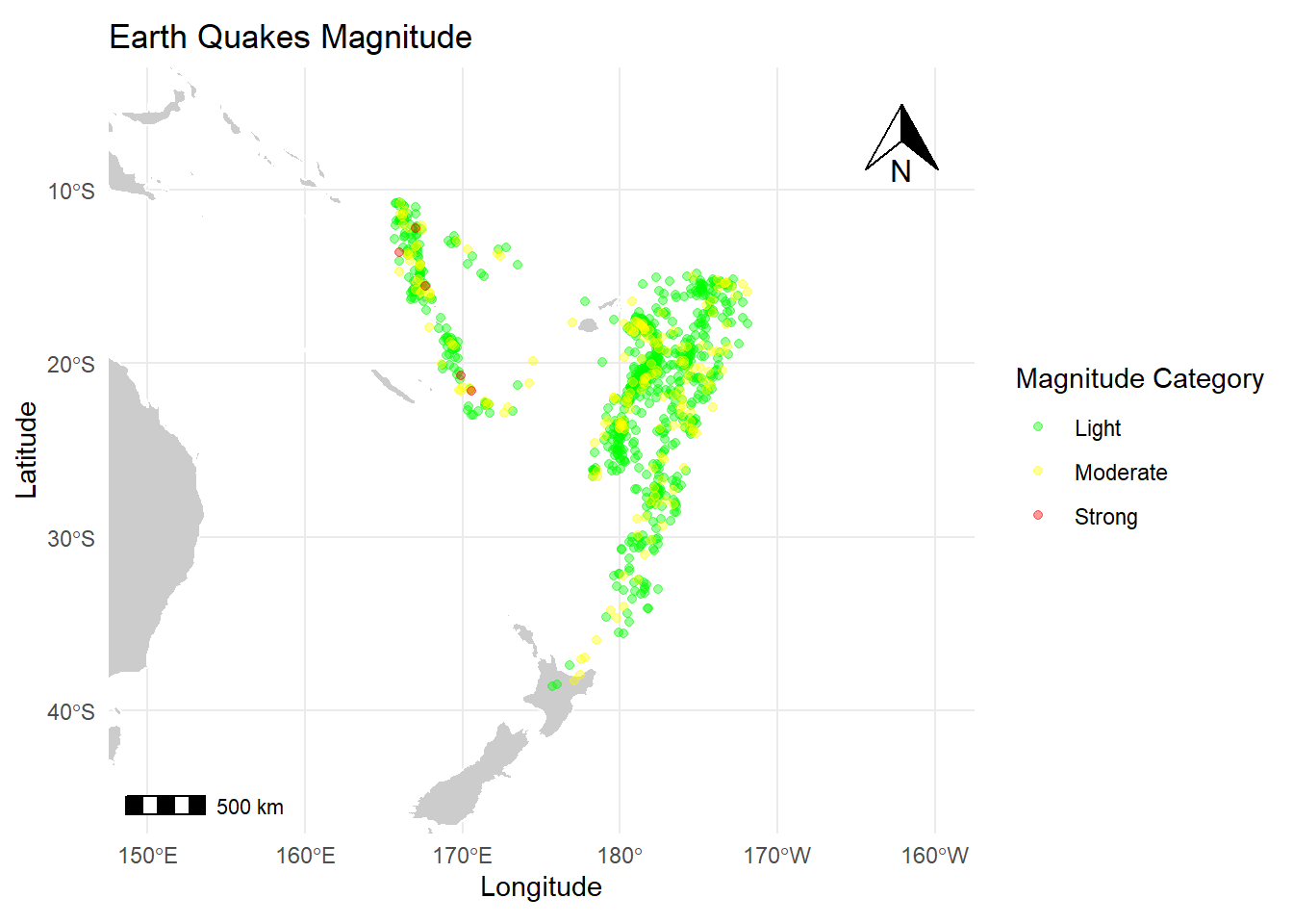
11.10 Plot an Interactive map with leaflet
In addition to static maps, it is also possible to create interactive maps using the leaflet package.
The leaflet package allows you to create interactive maps of different styles, OMS, satellite, stem, etc.
To demonstrate, we will use the earthquake dataset again.
# Create an interactive map
map6 <- leaflet() %>%

# Add the base layer map (called tiles) (Default OpenStreetMap tiles)
  addTiles() %>%

# Choose a style, here we choose satellite imagery
  addProviderTiles(providers$Esri.WorldImagery) %>%

# Add our spatial data
  addCircleMarkers(data = data,
                   ~long, ~lat,  # Specify the longitude and latitude columns from your data set
                   color = "red",
                   radius = 5,
                   popup = ~paste("Lat:", lat, "<br>", "Lon:", long))

# View map
map6
11.11 Customizations
Cluster Points
We can use the addMarkers() function to cluster points when working with a dense dataset. This function helps manage overlapping points by grouping them into clusters, making the map clearer and more readable.
map7 <- map6 %>%

# Cluster our points
  addMarkers(data = data, ~long, ~lat, clusterOptions = markerClusterOptions())

# View map
map7
Pop-up text
If we want to display information when we click on a point, we can use the popup argument within the addCircleMarkers() function. The popup argument allows you to specify what content should appear.
We can use paste to combine text with variables, and the <br> tag can be added for line breaks, helping with formatting in the popup.
For example:
map8 <- map7 %>%

# Add popup text
  addCircleMarkers(data = data,
                   ~long, ~lat,
                   color = "red",
                   radius = 5,
                   popup = ~paste("Station:", stations, "<br>", "Magnitude:", mag, "<br>", "Depth (m):", depth ))

# View map
map8
Colors and Legend
To group data by a variable and set a color legend, we first create a color palette using the colorNumeric() function and define the domain argument by our grouping variable.
Here we’ll group the earthquakes by magnitude.
# Define a color palette for magnitude
palette <- colorNumeric(
  palette = "viridis",  # Choose a color scheme (e.g., "YlOrRd", "Viridis", "Blues")
  domain = data$mag    # Magnitude
)
We can now integrate the color palette with the addCircleMarkers() function and add a legend with the the addLegend() function. In this function, we can define arguments such as the color palette (pal) (which should match the one used in addCircleMarkers()), the title, and labFormat to customize the appearance of the legend.
# Create an interactive map
map9 <- leaflet() %>%

# Add the base layer map (called tiles) (Default OpenStreetMap tiles)
  addTiles() %>%  # Default OpenStreetMap tiles

# Choose a map style
  addProviderTiles(providers$Esri.WorldImagery) %>%  # Satellite map

# Group data by magnitude and add popup text
  addCircleMarkers(data = data,
                   ~long, ~lat,
                   color = ~palette(mag),  # Assign colors based on magnitude
                   radius = 5,
                   popup = ~paste("Magnitude:", mag)) %>%  # Add popups

# Add a color legend
  addLegend("bottomright",
            pal = palette,
            values = data$mag,
            title = "Magnitude",
            labFormat = labelFormat(digits = 1),
            opacity = 1)

# View map
map9
Title
To add a title to an interactive map we use the addControl() function where we name and position the map title.
map10 <- map9 %>%

# Add title
  addControl("<strong>Earthquake Magnitude Map</strong>",
             position = "topright")

# View map
map10
Scale bar
To add a scale bar we simply use the addScaleBar() function and specify where we want it on our map (e.g topright, bottomleft).
11.12 Save your map
You can save an interactive map as a static image or ‘snapshot’ by using the mapshot() function from the mapview() package. While you lose the interactivity with this approach, it allows you to capture a snapshot of the map that you can use in presentations, documents, or other static outputs.
If you want to keep your map interactive, you can save it as an HTML file using the saveWidget() function from the htmlwidgets package. This way, the map remains interactive, and you can easily share it by sending the HTML file or sharing a link.
11.13 Chapter wrap up
This chapter explored various methods for creating maps in R, each differing based on the source and type of base map. Once a base map is chosen and plotted, the overall approach remains consistent: layering spatial data, setting axis limits, adding labels and legends, and including scale bars and north arrows.
11.14 Additional Links & Resources
If you are still confused, or you would like more information on topics discussed in this chapter, check out the following links: