Chapter 9 Plotting
In this chapter we will go over how to visualize research data using R. You will learn how to navigate and use ggplot2 to visualize and plot your data, how to modify and customize theme elements, and how to annotate plots.
9.1 Introduction
ggplot2 is used to visualize and plot data. It is compatible with tidyverse and recognizes the use of other tidyverse functions within its’ own plotting functions, which makes it easier to customize plots. This package also offers a wide variety of customization and theme options compared to other plotting functions, which is beneficial because there are many different figure formatting requirements used throughout scientific journals and academic institutions.
9.1.1 Installation
ggplot2 is a package within tidyverse and isn’t something that is installed and loaded separately. There are additional packages that have been created that allow you to create additional visualizations and perform more advanced customizations within your plots.
We will show you how to install and load the ggplot2 package as a stand alone package but remember:
If you have loaded tidyverse in your script, you do not need to load ggplot2.
9.1.2 Syntax & Layers
ggplot2 plots work best with data in the ‘long’ format, i.e., a column for every variable, and a row for every observation. Well-structured data will save you lots of time when making figures with ggplot2.
ggplot2 graphics are built layer by layer by adding new elements. Adding layers in this fashion allows for extensive flexibility and customization of plots.
When creating plots you will notice the use of the + operator, this is because ggplot2 objects are layered. You are adding layers to a plot, and each layer is done in the order it is written.
This is important to remember because some plot elements may get overwritten and displayed incorrectly depending on the order the layers are added.
9.2 Basic Plotting
9.2.1 Plot Template
All plots created using ggplot2 follow the same template, which we build off of. It is a greate practice to set up all of your plots using the same template to help find errors, or change aspects of specific or individual plot layers further in your customization process.
To build a plot, we will use the following template to start:
use the ggplot() function and bind the plot to a specific data frame using the data argument, like this:
Everything contained within the ggplot() function are global options, meaning unless told otherwise it is the default for each layer. This can sometimes cause issues when using more advanced plotting functions, or when adding additional layers.
To make sure the information for each layer is correct, and not accidentally applied to other layers, is is best practice to limit the information specified within the ggplot() function to the data = argument.
This also helps you find errors or issues within your plot, because all of the code for each layer is together.
9.2.2 Geoms & Aesthetics
The next step is to use the + operator to add ‘geoms’ – graphical representations of the data in the plot. ggplot2 offers many different geoms; we will use some common ones today, including:
geom_point()for scatter plots, dot plots, etc.geom_boxplot()for, well, boxplots!geom_histogram()for histograms.geom_line()for trend lines, time series, etc.
Within the geom function you must define the plot aesthetics, or what the geom is supposed to visualize. This is done using the mapping = argument. This argument will contain all of the information for how your data affects the look of this geom, meaning variables, colours, size, shape, groups, etc.. Only information that is dependent on your data is specified here, general specifications are supplied outside or the aes() function - more on this in the Customizing Plots section.
To do this, use the aes() function to select variables to be plotted and specify how they are presented.
Here is an example of a basic scatterplot created using geom_point():
# Create Plot
plot1 <- ggplot(data = mydata) +
  geom_point(mapping = aes(x = tl_mm, y = fl_mm))

# View plot
plot1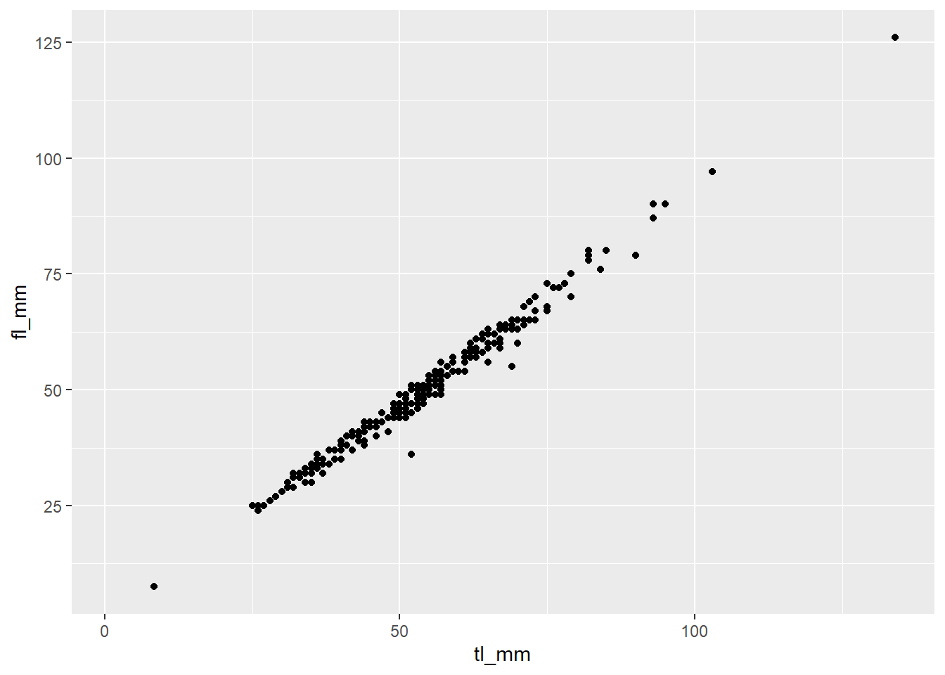
Sometimes different geom’s functions require different aesthetics. Like geom_histogram(), it requires an x or y!
# Create Plot
plot2 <- ggplot(data = mydata) +
   geom_histogram(mapping = aes(x = tl_mm))

# View plot
plot2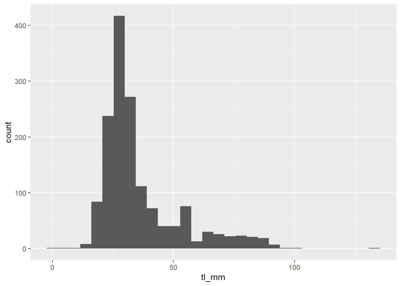
If you are ever unsure, or are receiving an error and can’t figure out why, click the help tab in the bottom right pane and search the geom function you are using to see which aesthetics are required.
Include an example image of the help page for a geom here maybe?
After you have used the template to create your basic plot, you can refer to other functions and aesthetic options to customize it! These are covered in the Plot Customization section of the chapter.
9.2.3 Saving Plots
After you finish creating your plot use the ggsave() function to export your plot into your Research Project folder. ggsave() allows you to easily change the dimension and resolution of your plot by adjusting the appropriate arguments (width, height and dpi).
By default, ggsave() exports the most recent plot found in the plot tab found in the bottom right pane. This can sometimes cause problems if you execute code out of order in your script. To help avoid this problem, it is best practice to assign plots to an object when creating them using the <- operator to allow you to view and refer to them later by calling the object from your environment.
Let’s export our histogram as an example:
Note: To help stay organized and easily find your plots, refer back to the Files and Folders chapter and apply those skills to export you plots into a designated figures folder!
9.3 Customizing Plots
Since you now have learned how to set-up your plot skeleton, let’s move into some common customization options!
9.3.1 Labels
You may have noticed the default ggplot2 labels are what is supplied to that aesthetic. This means that your axis labels are your variable names, i.e what you supplied in the x = or y = arguments of your geom.
To change existing labels, or add new labels, add (+) the labs() function to specify what you want the different labels to be!
Here is an example:
plot3 <- ggplot(data = mydata) +
  geom_point(mapping = aes(x = tl_mm, y = fl_mm)) +
  labs(title = "Species fork length (mm) versus total length (mm)",
       x = "Total Length (mm)",
       y = "Fork Length (mm)")

# View plot
plot3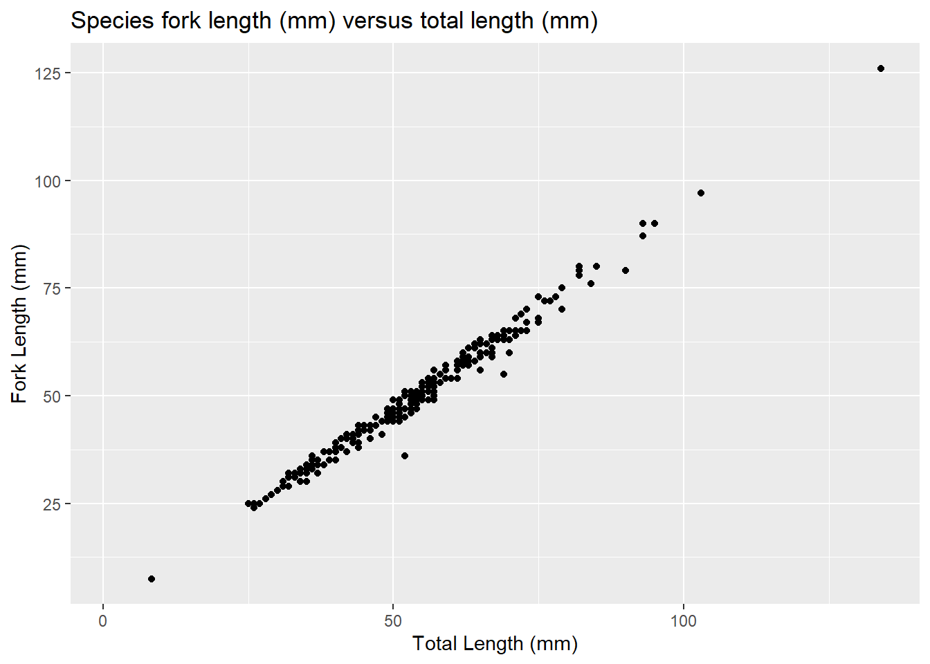
Note: specifying other aesthetics can add labels to plots, you can change these labels by referring to that aesthetic in the labs() function as well.
9.3.2 Layering Geoms
In ggplot2 you can layer geoms on top of each other to display your data. These layers can use the same variables in each geom, or different variables.
This can cause various issues and errors to arise and is why we want to avoid specifying our aes() in the ggplot() function and always define aes() in their specific layers.
Let’s look at some examples: CAN CHANGE THESE, JUST PUTTING SOMETHING HERE FOR NOW
# Layer geoms with the same variables
plot4 <- ggplot(data = mydata) +
  geom_point(mapping = aes(x = tl_mm, y = fl_mm)) +
  geom_line(mapping = aes(x = tl_mm, y = fl_mm))

# View plot
plot4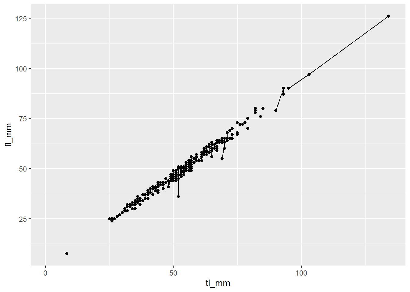
# Layer geoms with different variables
plot5 <- ggplot(data = mydata) +
  geom_point(mapping = aes(x = month, y = tl_mm)) +
  geom_line(mapping = aes(x = month, y = fl_mm))

# View plot
plot5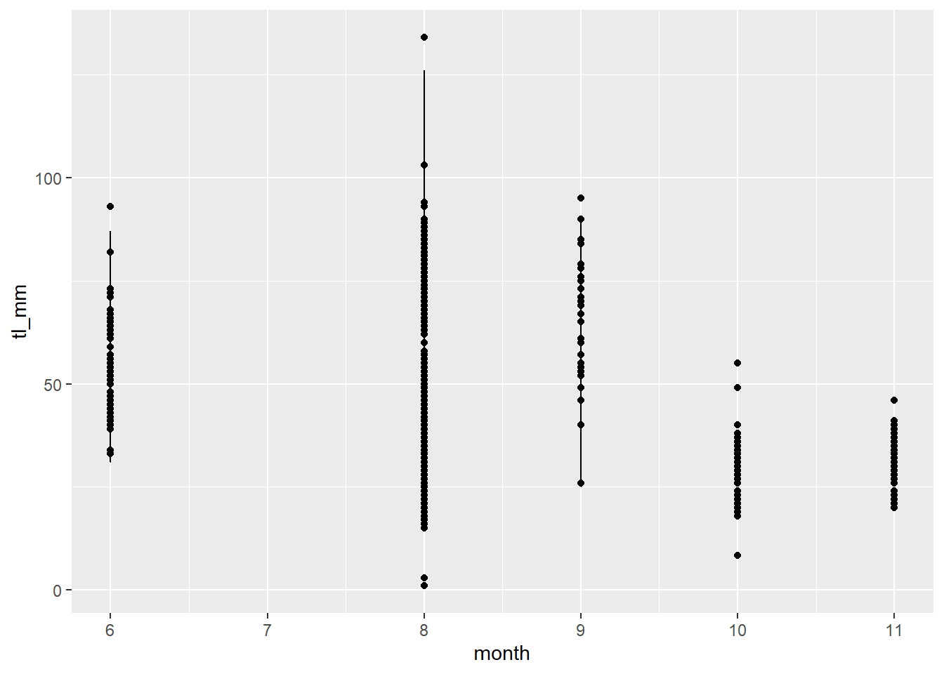
Note: Doing it this way may seem tedious however, it is the best way to minimize the risk of errors. Once you become more comfortable with your coding abilities, you can change your code to be more streamlined which makes writing code more efficient. For now, we will stick to the long way.
9.3.3 Size
In ggplot2 you can change the size of lines and points using the size = argument! Where this argument is specified changes how the aesthetic is affected. If you want to have the size dependent on a variable within your dataset, you must specify size = within aes(). A general size specification can be done outside of the aes() function.
For example:
# Specify size as the variable: month
plot6 <- ggplot(data = mydata) +
  geom_point(mapping = aes(x = tl_mm, y = fl_mm, size = month))

# View plot
plot6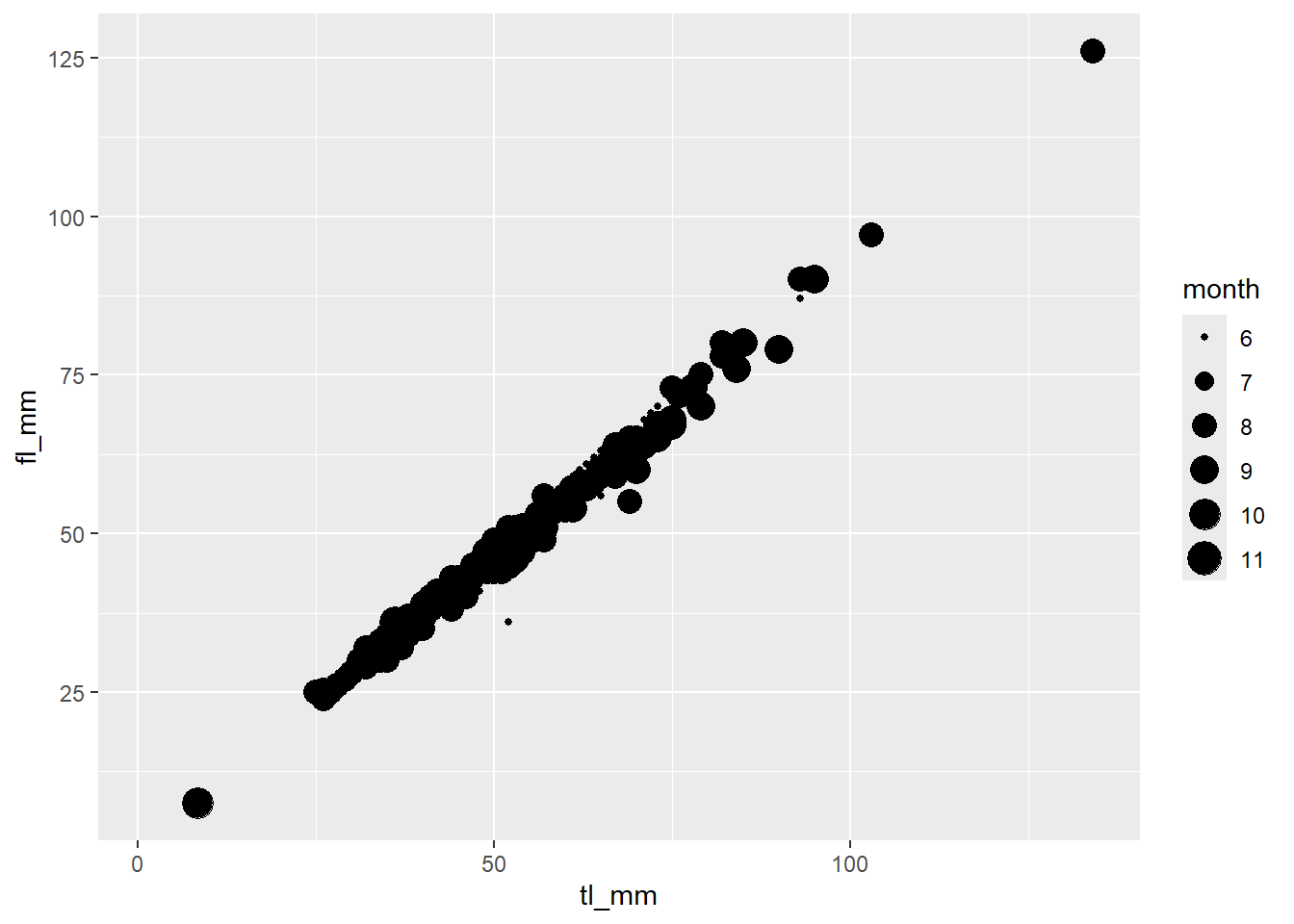
# Specify size as a general number
plot7 <- ggplot(data = mydata) +
  geom_point(mapping = aes(x = tl_mm, y = fl_mm),
             size = 3)

# View plot
plot7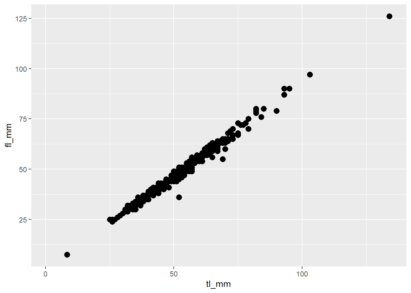
9.3.4 Colours
Colours can be added to ggplot2 plots in many different ways. There a lots of packages that are compatible with ggplot2!
Referring back to the previous section for customizing size, where you specify colours is dependent on how you want the colours to look.
Let’s try specifying the colour we want our data to be, outside of the aes() function:
plot8 <- ggplot(data = mydata) +
  geom_point(mapping = aes(x = fl_mm, y = tl_mm),
             color = "blue")

# view plot
plot8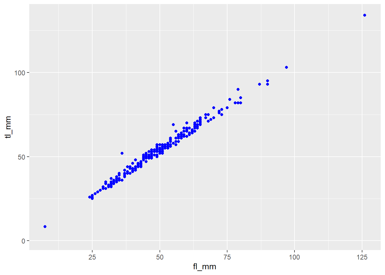
We can also specify colours to variables, where a different colour is associated to each value within the variable!
Remember, ggplot2 recognizes variable types, or classes, and how colours are displayed changes for continuous and categorical variables. Sometimes this can cause an issue, but it can easily be fixed!
Let’s take a look.
## Categorical Variable for Colour
plot9 <- ggplot(data = mydata) +
  geom_point(mapping = aes(x = tl_mm, y = fl_mm, color = site))

# view plot
plot9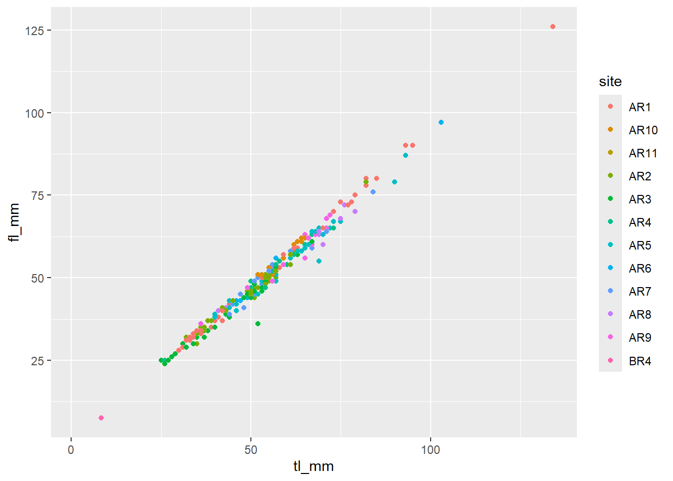
## Continuous Variable for Colour
plot10 <- ggplot(data = mydata) +
  geom_point(mapping = aes(x = tl_mm, y = fl_mm, color = month))

# view plot
plot10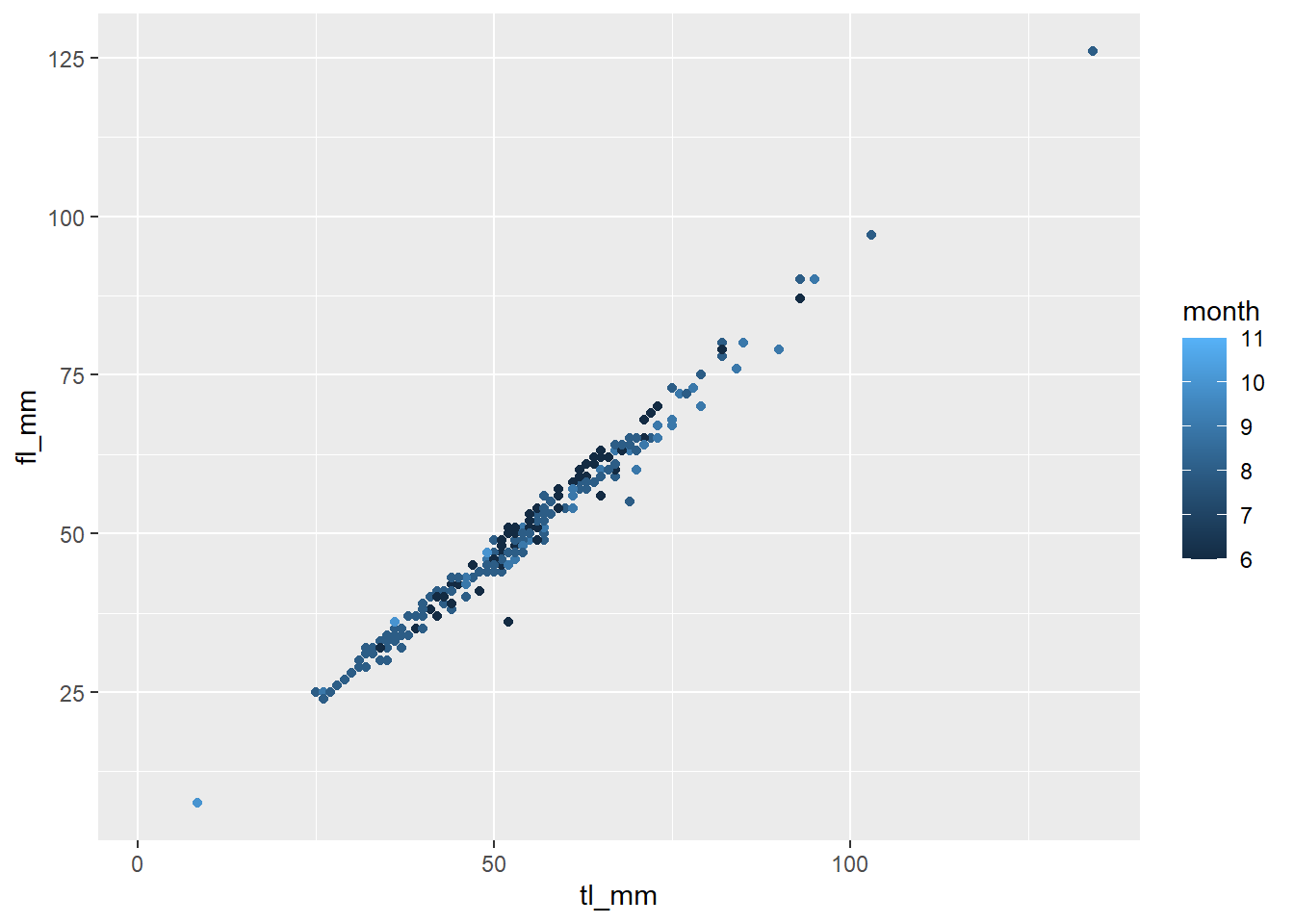
## Let's change a continuous variable into a factor
plot11 <- ggplot(data = mydata) +
  geom_point(mapping = aes(x = tl_mm, y = fl_mm, color = as.factor(month)))

# view plot - Notice the difference
plot11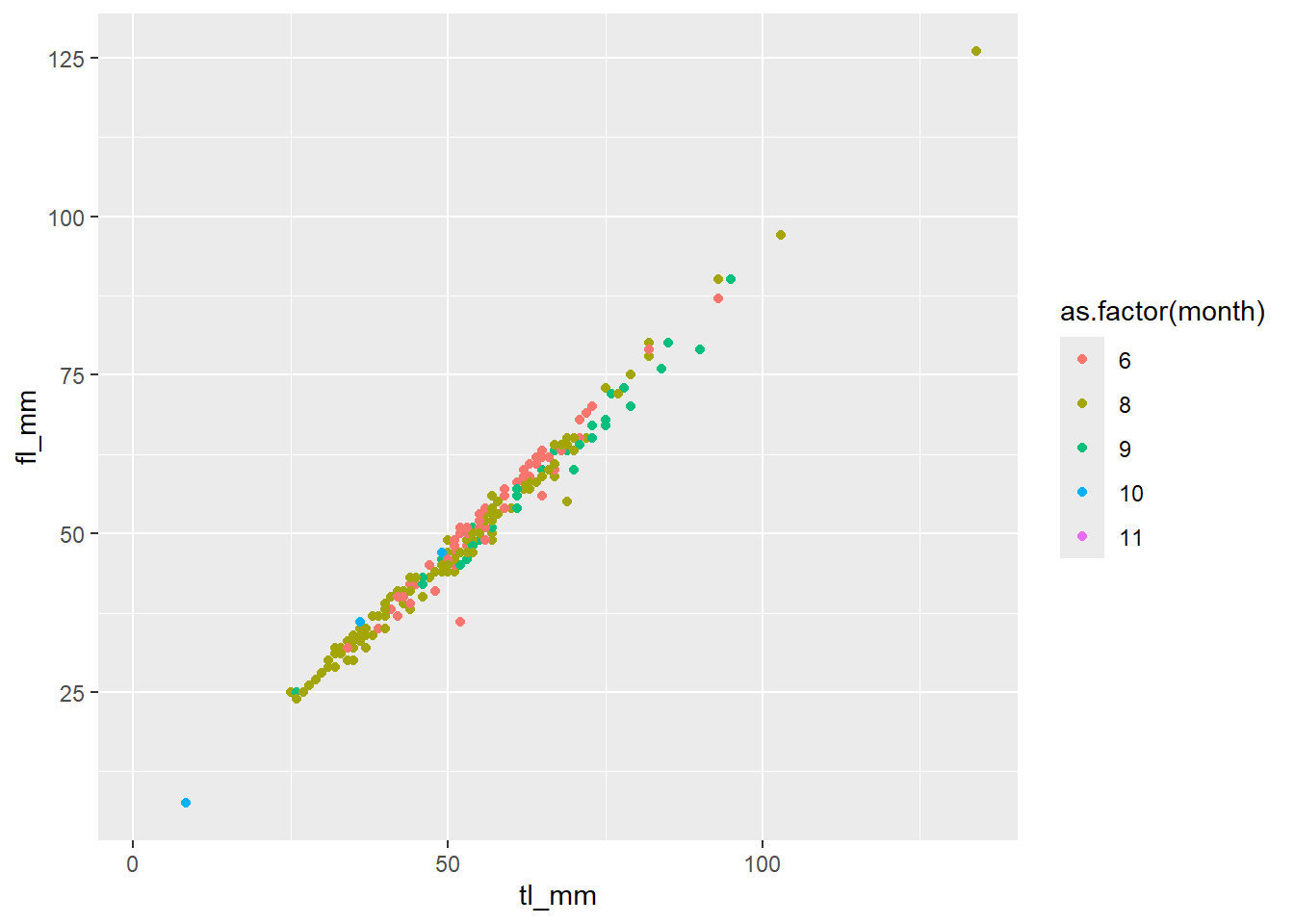
There are certain plots that have multiple colour arguments, colour and fill. Think of the colour argument as the outline, and fill as the interior of the shape.
Let’s look at an example:
plot12 <- ggplot(data = mydata) +
  geom_boxplot(mapping = aes(x = month, y = tl_mm, fill = common_name))

# view plot
plot12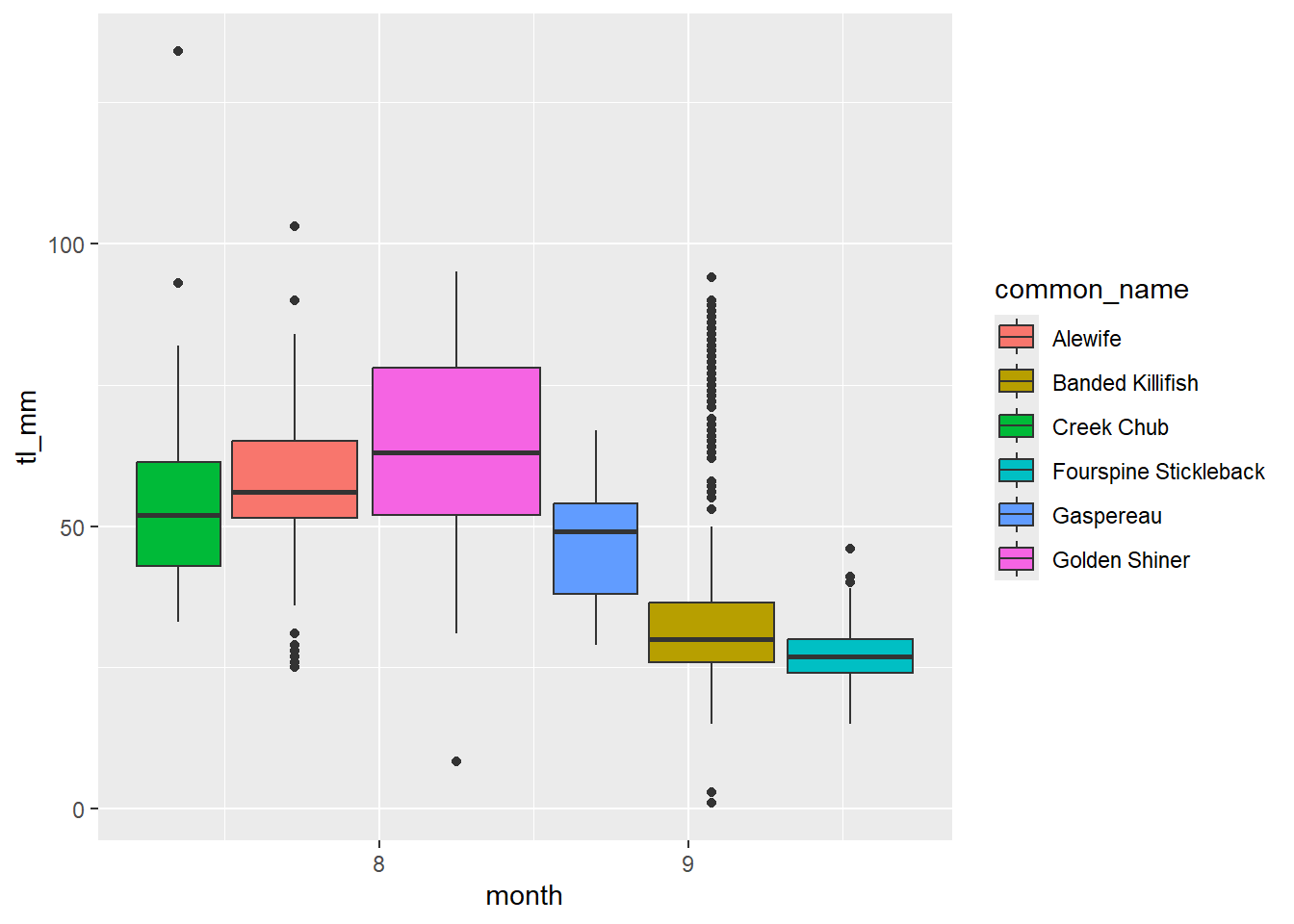
9.3.5 Grouping
By default, the group aesthetic is set to all of the discrete variables within the plot. When you have continuous variables and want to communicate the difference between groups or sub-groups (for example: species), you can go about this in different ways.
There are other aesthetics that act as a grouping method, including fill, linetype, shape, and colour and size like we mentioned before.
Using factor() is often necessary to have proper grouping done on variables. Lets show you…
## Boxplot without grouping argument
plot13 <- ggplot(data = mydata) +
  geom_boxplot(mapping = aes(y = tl_mm))

# view plot
plot13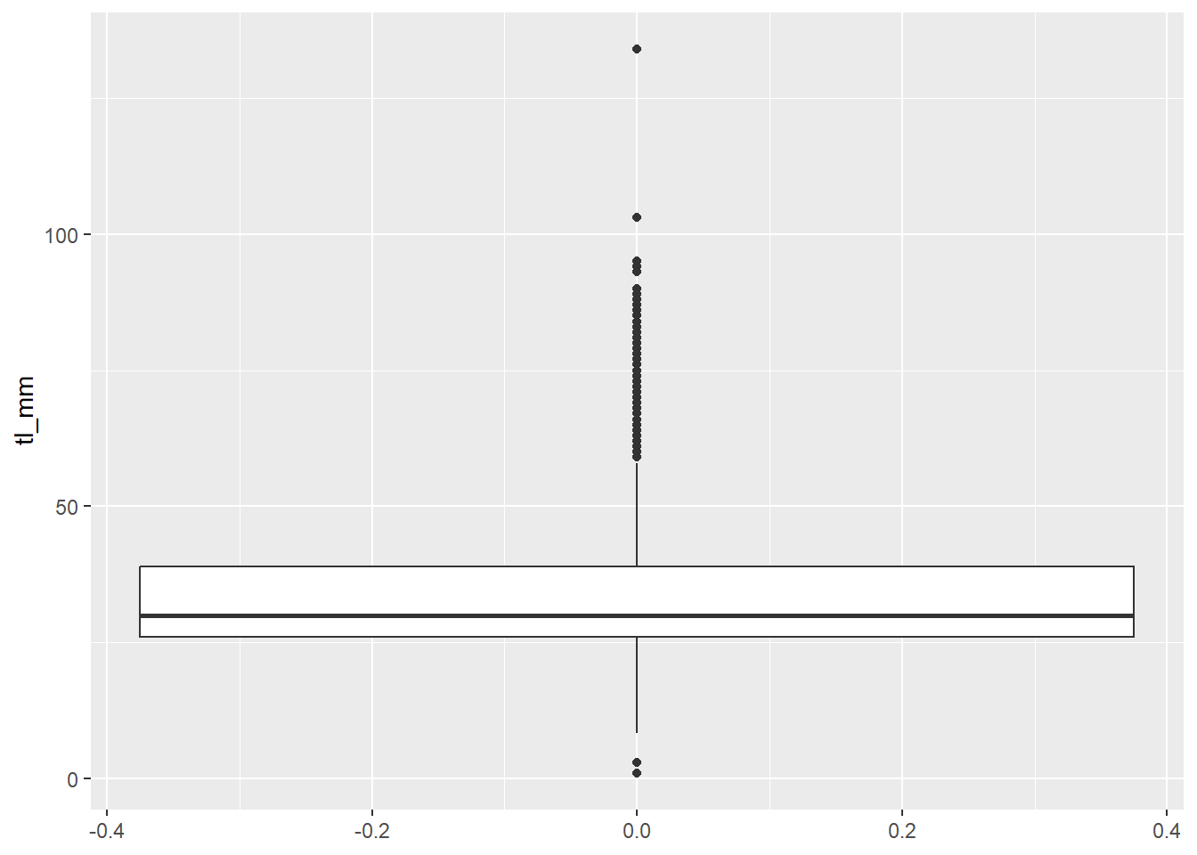
## Boxplot with grouping argument
plot14 <- ggplot(data = mydata) +
  geom_boxplot(mapping = aes(y = tl_mm, group = common_name))

# view plot
plot14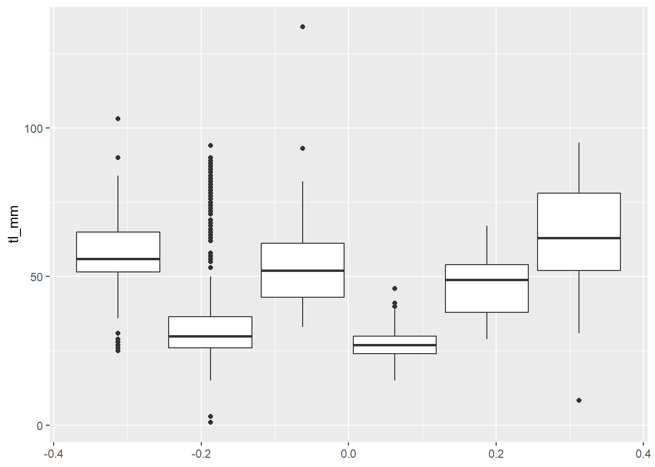
9.3.6 Facets
Another way to display groups, is by using facet_wrap(). You use this when you have one variable with multiple levels.
You can specify what variable you want to facet by, and you can also specify the number of rows = and col = in your facet!
## Facet by 1 variable
plot15 <- ggplot(data = mydata) +
  geom_point(mapping = aes(x = tl_mm, y = fl_mm)) +
  facet_wrap(~common_name, nrow = 2)

# view plot
plot15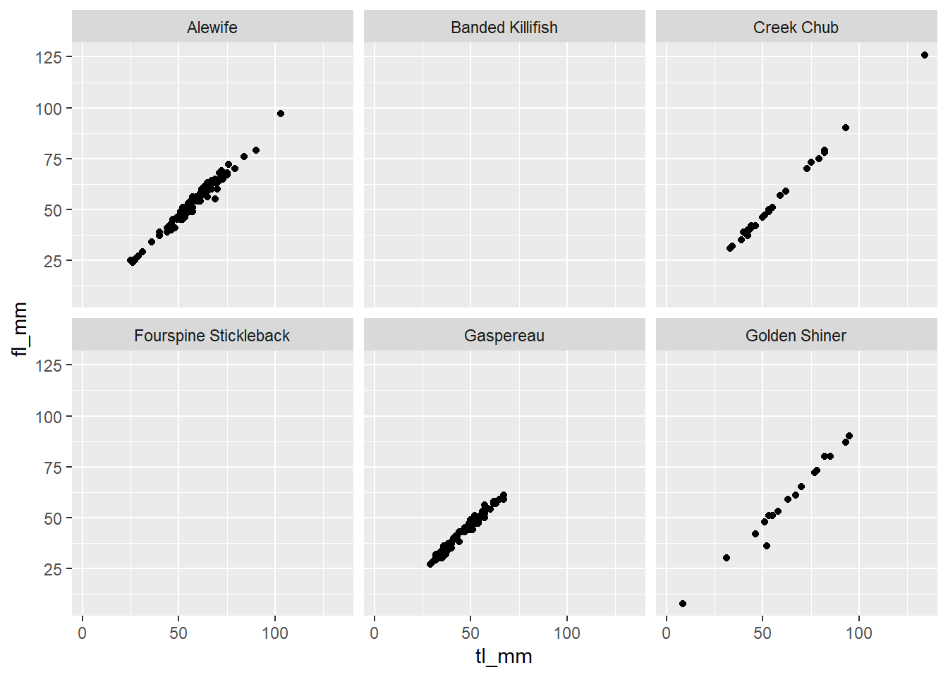
## Facet by 2 variables
plot16 <- ggplot(data = mydata) +
geom_point(mapping = aes(x = tl_mm, y = fl_mm)) +
facet_wrap(~common_name+month, ncol = 4)
# view plot
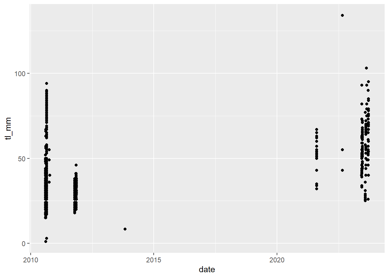
plot16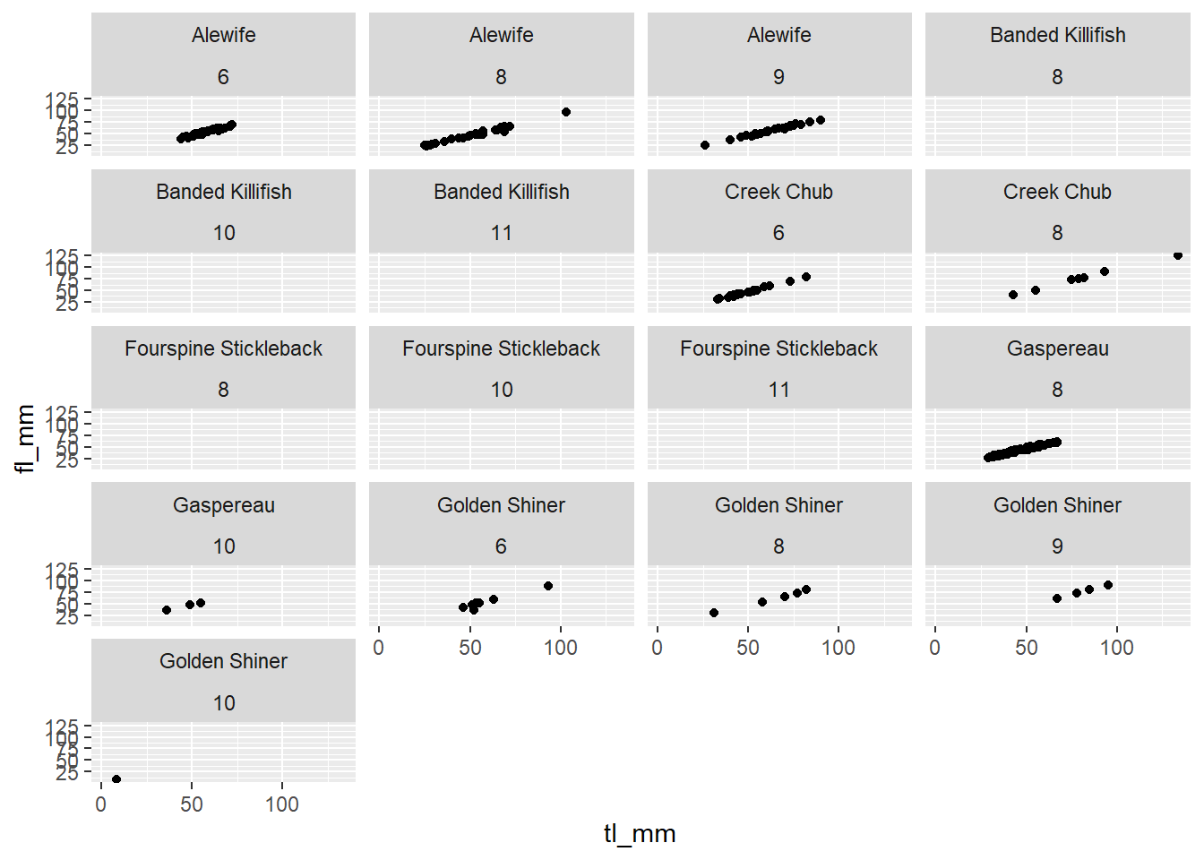 ### Plotting with Dates
In ggplot2 you can do some cool things with dates and times, but when doing this you need to make sure you have the lubridate package loaded.
* Reminder: you can do this by running library(lubridate)
ggplot2 automatically recognizes dates and uses a specific type of x axis, but if this doesn’t work, go back and check the date format in your data and try again.
9.4 Theme Options
9.4.1 Introduction & Preset Themes
Although there are many ways to customize plots within the different geom functions, there are more customization options available within various theme functions.
ggplot2 comes with some theme functions, where styling aspects are pre-defined. theme_bw() is one often used. Compare the look of this plot to the previous plots to see how theme_bw() changes!
plot18 <- ggplot(data = mydata) +
  geom_point(mapping = aes(x = tl_mm, y = fl_mm)) +
  theme_bw()

# view plot
plot18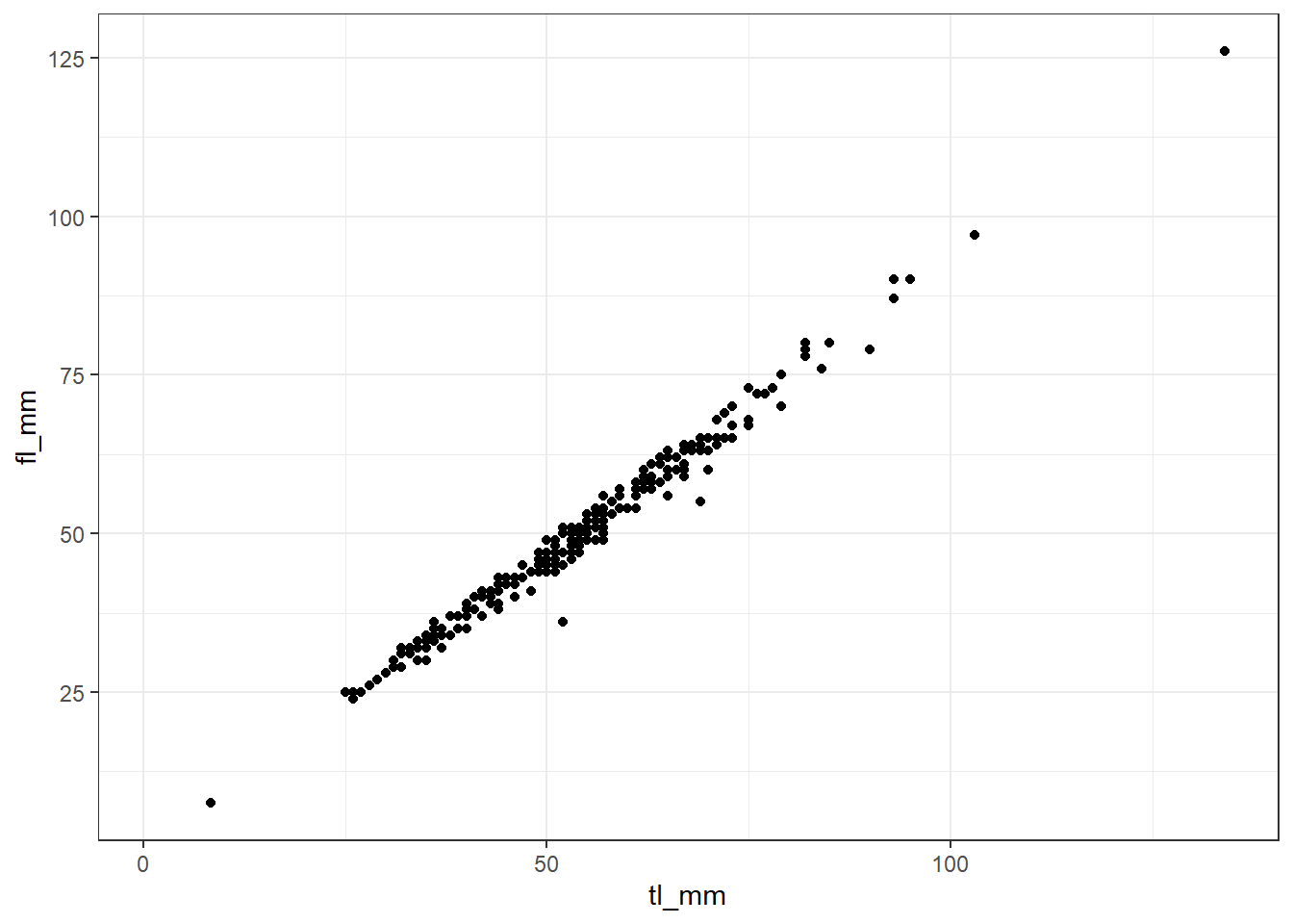
Beyond that, themes in ggplot2 are composed of 3 main components:
- You can specify changes to your theme using the
theme()function - Theme elements or arguments specify the non-data things that you can control.
- Each theme argument is associated with an element function that describes the visual components of that argument.
Putting this all together we can change the look of almost everything in the plot!
GIVE SOME EXAMPLES HERE OF PLOT THEME OPTIONS
9.4.2 Legends
ggplot2 builds your plots legend by default from what you have specified within your aes().
- Note: go back up to previous plots to see examples of this!
Sometimes we want to make changes to how our legends look, and we can do this easily with help from the theme() function we learned about last day and with the labs() function from a while back.
labs() is self-explanatory, it lets you change the legend labels.
# plot17 <- ggplot(data = mydata, mapping = aes(x = total_length_mm, y = fork_length_mm, colour = factor(site))) +
#   geom_point() +
#   labs(colour = "Collection Site")
#
# # view plot
# plot17
Removing legends can sometimes be a little confusing. Sometimes you want to remove the legend entirely, and other times you may want to remove one part of the legend. You can do this using guides() and theme().
# plot18 <- ggplot(data = mydata, mapping = aes(x = total_length_mm, y = fork_length_mm, colour = factor(site))) +
#   geom_point() +
#   theme(legend.position = "bottom")
#
# # view plot
# plot18- Note: the
legend.postionargument is also used to specify where on the plot you would like to see the legend. It also accepts"bottom","top","left", etc.
# plot19 <- ggplot(data = mydata, mapping = aes(x = total_length_mm, y = fork_length_mm, colour = factor(site), size = month)) +
#   geom_point() +
#   labs(colour = "Collection Site") +
#   guides(size = FALSE)
#
# # view plot
# plot19
You can also provide a specific location to the legend, within the plot using the legend.position argument by providing a vector of 2, where each point is a number from 0 - 1 and represents its position on the plot grid.
# plot20 <- ggplot(data = mydata, mapping = aes(x = total_length_mm, y = fork_length_mm, colour = factor(site))) +
#   geom_point() +
#   labs(colour = "Collection Site") +
#   theme(legend.position = c(0.9, 0.6))
#
# # view plot
# plot20
Major appearance changes to the legend are done with arguments in the theme() function. Here are some examples with what they do:
legend.position- Position around the plotlegend.justification- sets the corner that the position refers toolegend.box- rectangle that frames the legend and can be given features withelement_rect(). you can also make further specifications withlegend.box.backgroundorlegend.box.marginlegend.key- the symbols within the legend that are shown on the plotlegend.text- change the size, font, colour, or the textlegend.title- similar tolegend.text
These are not all of the theme() arguments for altering the appearance of the plot legends, but you can explore these different options for yourself!
9.4.3 Scales
Scaling in ggplot2 can get quite confusing. There are many functions and ways to do things. Although changing the plot scales are done in a separate function, it is similar syntax to options with the theme() function.
Scaling functions are made up of arguments name, breaks, and labels where name is the label title, breaks is how the ticks or legend key should be, and label is the labels of the ticks or legend keys.
The functions that use these are made up of parts, scale_whattoscale_type(). The functions always begin with scale_, the middle part changes depending if you are altering the scale of x, y, fill, or color. The last section represents the type and can be continuous, discrete, date, or manual.
Here’s an example:
plot19 <- ggplot(data = mydata) +
  geom_point(mapping = aes(x = tl_mm, y = fl_mm)) +
  scale_x_continuous(breaks = c(0,20,40,60,80,100,120,140)) +
  scale_y_continuous(breaks = c(0,20,40,60,80,100,120,140))

# view plot
plot19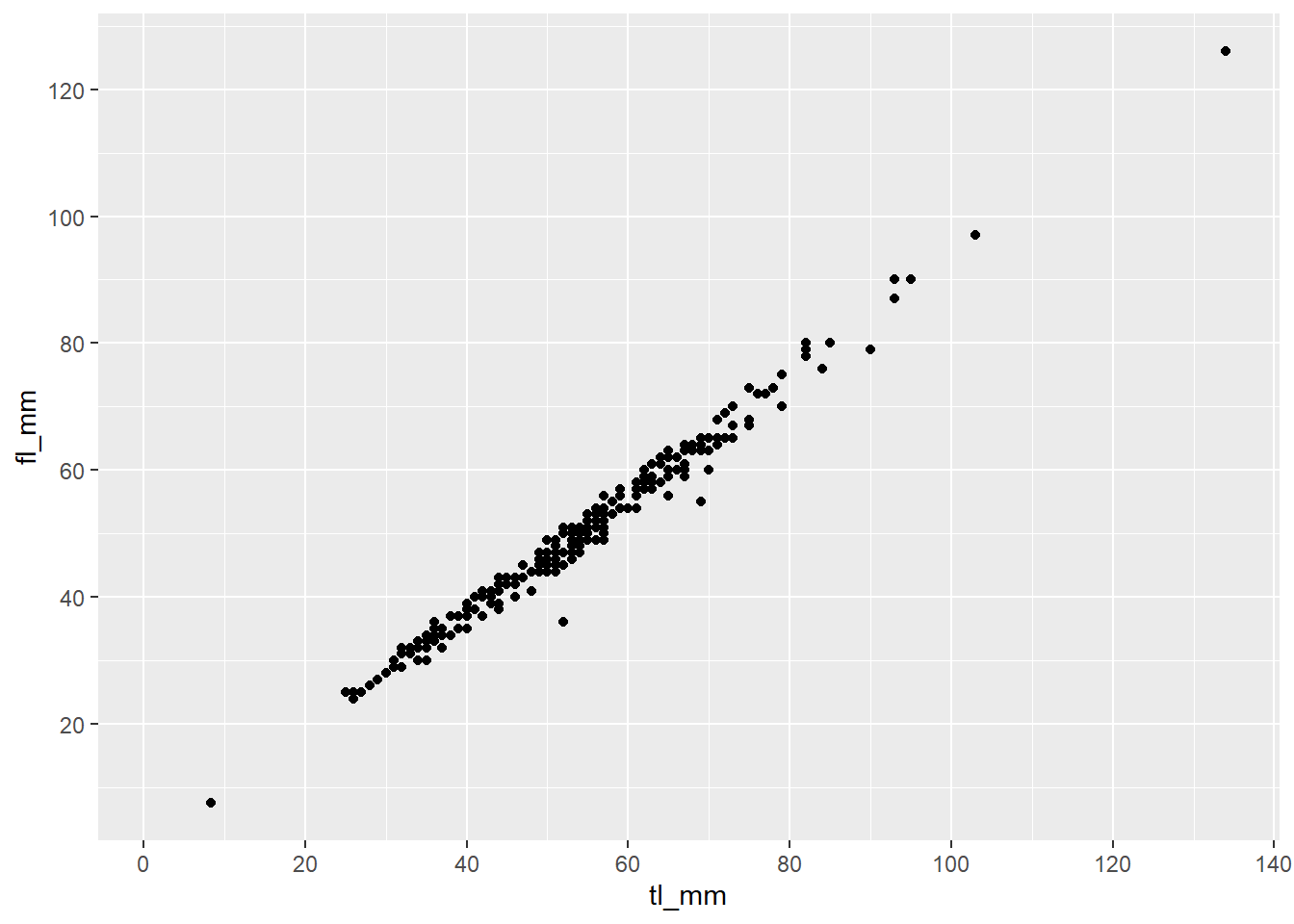
Again, explore and play around with the different scaling functions to change the look of your variable scales!
9.5 Advanced Plotting
You can take plotting a step further and add annotations, images, trendlines, and equations. Let’s take a look.
9.5.1 Annotations
There are multiple ways to annotate your plots. Check the link provided under the resources section for ggplot on ACORN to see other ways to do this.
An easy way to annotate your plots is done using the function annotate() because it allows for more than just text. You just have to specify the type or geom, location (x, y), size, colour, etc. Here are some examples:
9.5.1.1 Text
# plot21 <- ggplot(data = mydata, mapping = aes(x = total_length_mm, y = fork_length_mm, colour = factor(site))) +
#   geom_point() +
#   labs(colour = "Collection Site") +
#   annotate("text", x = 60, y = 30,
#            label = "SICK PLOT BRO!",
#            size = 7, angle = 45,
#            colour = "blue3")
#
# # view plot
# plot21
9.5.1.2 Shapes and lines
- Note: adding lines can be done with other functions
# plot22 <- ggplot(data = mydata, mapping = aes(x = total_length_mm, y = fork_length_mm, colour = factor(site))) +
#   geom_point() +
#   labs(colour = "Collection Site")
#
# # Add rectangles
# plot22 + annotate("rect", xmin=50, xmax=70, ymin=30, ymax=65, alpha=0.2, color="blue", fill="blue")
#
# # Add segments
# plot22 + annotate("segment", x = 15, xend = 55, y = 25, yend = 15, colour = "purple", size=7, alpha=0.6)
#
# # Add arrow
# plot22 + annotate("segment", x = 10, xend = 40, y = 15, yend = 60, colour = "pink", size=6, alpha=0.9, arrow=arrow())
#
# # Horizontal Line
# plot22 + geom_hline(yintercept=25, color="orange", size=1)
#
# # Vertical Line
# plot22 + geom_vline(xintercept=30, color="orange", size=1)
9.5.2 Images
To add images to your plot you need to determine what type of annotation you want to do because there are multiple ways to do this! Annotating one image, or using images for your data points.
- Note: these methods are done using additional packages, make sure you load them in within your script!
# # Load packages
# library(png)
# library(grid)
#
# # Load image
# img <- readPNG("lesson3_demoimage.png")
# plotimage <- rasterGrob(img, interpolate=TRUE)
#
# # create plot
# plot23 <- ggplot(data = mydata, mapping = aes(x = total_length_mm, y = fork_length_mm, colour = factor(site))) +
#   geom_point() +
#   labs(colour = "Collection Site") +
#   annotation_custom(plotimage, xmin=80, xmax=140, ymin=10, ymax=70)
#
# # view plot
# plot23
This method requires you to add the image paths to your data frame, meaning you can specify different images for different groups!
# # Load additional packages
# library(ggimage)
#
# # Format data
# mydata2 <- mydata %>%
#   mutate(image = "lesson3_demoimage.png") %>%
#   # filtering data for easier viewing
#   filter(year == 2021)
#
# # create plot
# plot24 <- ggplot(data = mydata2, mapping = aes(x = total_length_mm, y = fork_length_mm)) +
#   geom_image(aes(image = image), size = 0.10)
#
# # view plot
# plot24- Note: make sure to specify the size of the picture!!
9.5.3 Trend Lines
There are multiple ways to do this. The first, or simplest, is to use geom_smooth().
# plot25 <- ggplot(data = mydata, mapping = aes(x = total_length_mm, y = fork_length_mm)) +
#   geom_point() +
#   geom_smooth(method = lm)
#
# # view plot
# plot25- Note: We specified a linear regression as our trend line, the default is a loess line.
You can specify arguments within the geom_smooth() function and can change different things:
sizecolourgroupformulamethodse- removes confidence interval shading if set toFALSElevel- controls confidence interval levels, 0.95 is default
Try exploring different variables, groups, and plots to add your trend lines too.
9.5.4 Equations
Adding equation labels to a ggplot2 can be a little confusing. Think of it as an extension of the annotating section we talked about last day!
The main thing you need to remember is that you will always be adding to this template: annotate("text", parse = TRUE). You then sepcify the x and y locations on the plot to be where you want the equation label, and your expression will go into the label argument.
The mathematical expression is a mix of text, and R code… yay
- To display 2 variables beside eachother use
* - To display an operator, place them inside of
%%, ex:%*%is multiplication - Fractions -
frac(x, y) ^exponent - use{}after to wrap more than 1 character into the exponent- Use single quotes to display regular text
'' - Designations are the same, ex:
==,!=, etc
You can run demo(plotmath) to see many examples of mathematical expressions!
Here is the previous plot with an equation label attached to it:
9.6 Chapter Wrap-Up
9.6.1 Chapter Terms & Definitions
Here is a summary of some of the bolded terms used throughout this chapter, refer back to this list whenever you need a refresher!